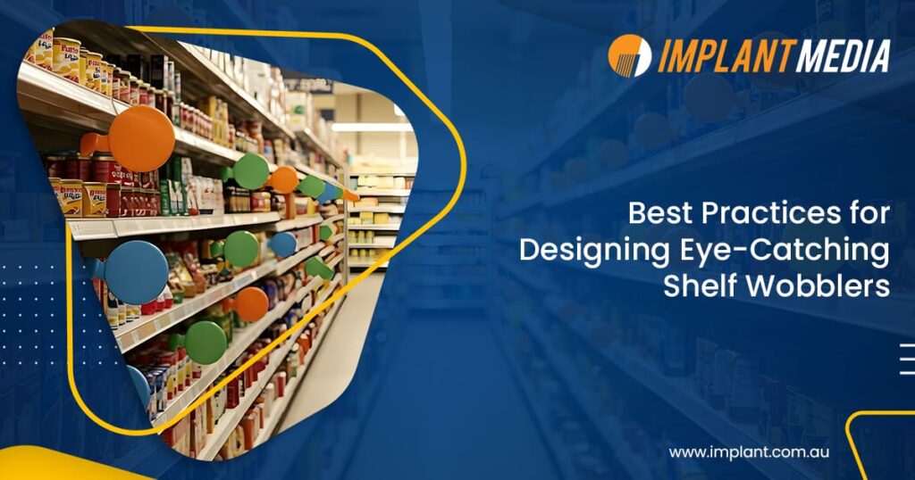
Ever walked down a store aisle and wondered why some products just grab your attention right away? Others kinda disappear into the background. You are looking at a bunch of cereal boxes. Suddenly one just pops out at you. Weird, right? Some brands, even on crowded shelves, manage to stand out effortlessly. Most of the time, it comes down to the tiny details. Things like shelf wobblers.
At first glance, shelf wobblers might look like small simple signs. They do a lot of heavy lifting in the store. They stick out from the shelf. They wobble a little when you brush past. Somehow they just catch your eye. That is why they are perfect for creating eye-catching product displays. They make shoppers stop and look.
So the big question is this. How do you make custom shelf wobblers that actually work? How do you design one that shoppers cannot just walk past without noticing? That is what we are going to break down.
Know Your Space and Audience
The first step in designing wobblers that actually work is understanding where they will go. You also need to know who will see them.
Not all shelves or store layouts are the same.
Think about your target audience.
- Who are the shoppers and what makes them pick one product over another?
- Are they hunting for a quick deal? Looking for something premium?
- Or grabbing something on impulse?
For example a snack brand aimed at kids might use bright colors and fun characters that make them smile. A premium chocolate brand might go for a sleek minimalist look that feels fancy.
Shelf height matters too. Eye-level shelves naturally get more attention. Your shelf wobblers design needs to match that so it really pops.
And do not forget competing signs! Shelves are busy places. Your wobbler has to stand out even when everything around it is shouting for attention.
Get these things right and your custom shelf wobblers will not just sit there. They will grab eyes. They will draw shoppers in. They will make an impact.
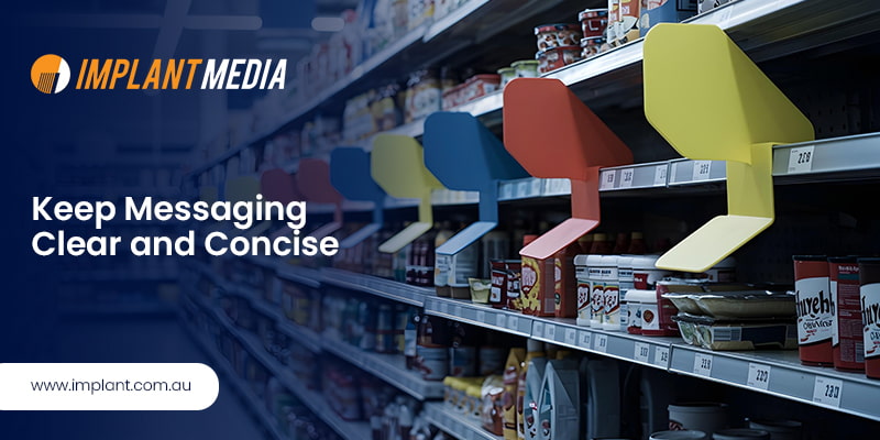
Keep Messaging Clear and Concise

Shoppers make decisions in seconds. A promotional shelf wobbler has to get the message across instantly. Use typefaces that people can read from a distance without effort.
Keep the message focused. Highlight just one point. It could be a discount or a special promotion. For example you could say “Buy 1 Get 1 Free“ or “New Flavor”. That short punchy line tells the shopper everything right away. The text should pop against the background so it is clear at first glance.
When your messaging is clear and simple shoppers understand the offer quickly. That quick connection is what drives engagement and boosts sales.
Use Shape and Motion
Shelf wobblers are different because their motion naturally pulls the eye. You can use this feature to your advantage.
Think creative shapes. Do not stick to plain rectangles or circles. Go for custom shelf wobblers cut into brand shapes or themed designs. For example a soda brand could use a bubble shape for a fun playful look. A featured product wobbler could be star shaped to highlight importance. A gentle wobble or a soft rotation catches attention. It draws shoppers in without being annoying.
Always match the design with your brand. The shape and motion should feel like they belong to your identity. That makes the in store display consistent and professional.
When you combine movement with unique shapes your shelf wobblers design becomes dynamic and memorable.
Use Colors Strategically
Color is one of the strongest ways to grab attention. It also reinforces brand identity in building brand recall.
- Start with a primary attention color. Bright shades like red or yellow or orange pull the eye right to the promotion.
- Then add secondary or accent colors. These highlight extra details without taking over the design.
- Think about visual hierarchy. Arrange the elements so the shopper first sees the main message and then the supporting info.
Done right, colour doesn’t just make your shelf wobbler stand out—it guides shoppers exactly where you want them to look.
When you use color with purpose your promotional shelf wobblers do more than stand out. They guide the shopper’s eye and make the key message clear.
Test and Refine for Maximum Impact
A wobbler can look great but still fail if it does not connect with shoppers. That is why testing and refining is so important.
Start by prototyping in real settings:
Place sample wobblers on shelves and watch how shoppers react. Do they notice it? Do they stop? That feedback is gold.
A B testing:
Try two different designs and see which one pulls in more attention or drives more sales.
Do not forget durability checks:
A good wobbler should handle constant movement and changes in the environment like humidity or heat.
When you invest time in testing you make sure your wobbler printing services deliver displays that are not only attractive but also reliable and effective.
Conclusion
Shelf wobblers may look small but their impact on in store visibility and sales is huge. Effective shelf wobblers design is not just about bold colors or fun shapes. It is about knowing how shoppers think and using that to create eye-catching product displays.
A custom shelf wobbler done right is never just another sign on the shelf. It is a powerful marketing tool. It grabs attention. It sparks interest. And it turns that attention into action
So here is the real question. How do you make sure your custom shelf wobblers do not just sit there but actually get noticed and remembered?
At Implant Media, we help brands bring these ideas to life. From creative design to high quality wobbler printing services we make sure your displays do more than just hang on a shelf. They stand out. They get remembered. And most importantly they deliver results.


