Nothing hurts your brand faster than a custom presentation folder that fails to impress.
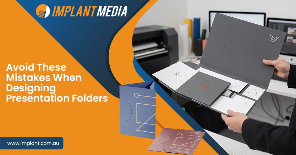
Business presentation folders are more than just document holders in fact they are a tangible representation of your business identity. A thoughtfully designed folder can leave a lasting impression on clients and organize materials efficiently thus showing that your brand pays attention to detail. On the other hand, a poorly executed folder can make even a successful business seem careless or unorganized.
Designing presentation folders requires balancing visual appeal and brand consistency. Every decision from material choice to layout contributes to how your brand is perceived. At Implant Media, we understand how the right presentation folder design can elevate your brand and make your business communication truly stand out.
Why Presentation Folders Still Matter
Even though digital communication is convenient, business presentation folders still hold unique value. There is something memorable about handing a client a neatly arranged custom presentation folder with well-organized documents. It communicates professionalism and care therefore helping your business stand out in meetings and events.
A high-quality and visually appealing folder demonstrates that you invest in your brand and take every detail seriously. Conversely, a poorly designed or low-quality folder can detract from your credibility and create the wrong impression.
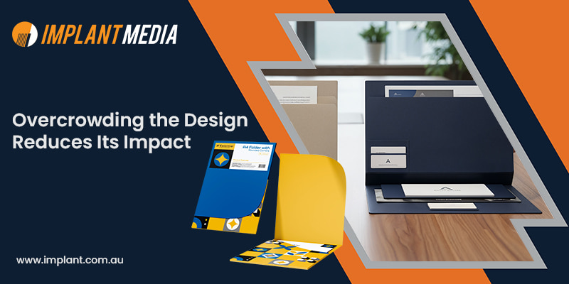
Overcrowding the Design Reduces Its Impact
One of the most common mistakes in presentation folder design is including too much information. Overloaded designs just end up feeling messy and it takes away from what actually matters. On the other hand, a clean and simple approach lets your branding really stand out. Sometimes less really is more, and a neat folder will stick in people’s minds way more than one packed with too many graphics or walls of text. Even small touches like a single accent color or simple lines can make a folder look polished without going overboard.
Material and Finish Speak Volumes About Quality
The materials you pick for custom presentation folders matter just as much as the design itself. Thin paper or a cheap finish can totally ruin an otherwise nice folder. Using thicker cardstock instantly gives a feeling of quality and durability. Finishes like matte, glossy, or textured surfaces add a nice touch you can actually feel, and little extras like embossing, foil stamping, or spot UV can make it look way more premium. Implant Media offers a range of high-quality printing finishes and materials, ensuring every presentation folder looks and feels professional.
Functionality Should Never Be Overlooked
A business presentation folder needs to work as well as it looks. Practical layout considerations make the difference between a folder that impresses and one that frustrates.
Before printing you need to make sure that pockets and slots accommodate all your documents comfortably. Business cards should fit securely and brochures or additional materials should sit neatly. If a folder looks eye-catching but is difficult to use, clients may leave with a less favorable impression of your brand. Testing your presentation folder design with real documents ensures that the design works in practice and not just on screen.
Consistent Branding Reinforces Professionalism
A common mistake when designing presentation folders is using outdated logos and mismatched fonts of colors that do not align with other marketing materials. Your folder should reflect your current branding and complement assets such as business cards, brochures and your website.
Consistency helps clients recognize your brand and builds trust. A folder that clashes with your brand identity may confuse recipients or make your business appear less reliable. Your custom presentation folders strengthen your overall brand image by ensuring all elements align
Focus on Details Makes a Difference
Even minor oversights can affect how your folder is perceived. Spelling errors or incorrect print bleed zones are small mistakes that stand out in professional settings.
Carefully proofread every design element and check alignment as well as color accuracy and dimensions. The smallest details contribute to a polished final product, making your business presentation folders a true reflection of your professionalism.
How to Make Your Folder Stand Out with Thoughtful Extras
Adding a few functional and aesthetic improvements can make your presentation folder design unforgettable. For instance:
- Incorporate a business card slot or pen holder for convenience.
- Select colors that represent your brand character; blue symbolizes dependability, whereas green transmits development and eco-friendliness.
- Include a pocket for brochures or inserts that stimulate interaction.
The people who use the folder will notice and remember it longer because of its functionality and attractiveness.
Final Thoughts
Custom presentation folders might appear as a trivial detail, but still are very potent instruments for influencing the client’s view. Avoiding poorly designed folders with a lot of colors, cheap materials, and lack of details can convert your folders into tools to impress your clients and improve your brand image.
A carefully designed business presentation folder is no longer just a holder for documents—it is a sign of professionalism, a reinforcement of brand identity, and a reflection of business excellence. If you’re looking for premium custom presentation folders in Australia, Implant Media provides exceptional design and printing services that bring your brand vision to life.