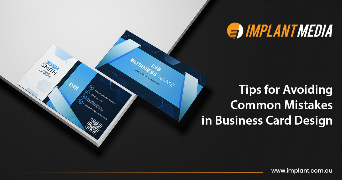
When you run a business, you must have business cards but it’s even more crucial to have the best and perfect business card design. The color palette, selection of fonts, design pattern, size, and shape of your custom business cards reflect your brand’s personality, values, and thoughts.
Designing a business card is very important as it creates a positive first impression, facilitating new relationships, and showcasing professionalism. It serves as a mind-striking and tangible representation of your business.
Before you plan your design, let’s understand the structure of business cards and the 10 tips to avoid the most common mistakes people make all the time.
Perfect Structure of Custom Business Cards
- The standard size of a business card should be 3.5 inches x 2 inches.
- Brand logo and company name should always be the priority.
- Choose a suitable design template for your professional business cards.
- Organize the information properly such as name, job title, business name, contact details, and social media handles.
- The fonts should be legible, easily understandable, and should be attention-grabbing.
- Leave some white space to improve the readability.
- Check the details and proofread multiple times.
10 Tips to Avoid Most Common Pitfalls in Business Card Design
Designing the perfect business card is crucial for any business as it reflects the personality of your brand. So here are some tips to help you avoid blunder mistakes in your professional business cards:
Avoid Cluttered Designs
Always keep the design plain and simple. Avoid overcrowding your business cards with too much text or unwanted graphics. But make sure to add all the necessary information such as:
- Your Name
- Contact Number
- Email Id
- Job Title
- Company Name
Never have Inconsistent Branding
Make sure the design of your business card compliments your brand as a whole. To maintain the consistency of your professional business cards, you should use the same color scheme, font, and logo that you have used in the other marketing materials.
Avoid Low-Resolution Images
Having grainy or distorted photos on business cards implies a lack of professionalism. They diminish the card’s potential to effectively convey the high standards and quality of your company by hindering its aesthetic attractiveness as well as undermining the overall impression.

Maintain Font Style
Readability is hindered by small or complex fonts that make content on business cards difficult to read. The card’s value is reduced when important information, such as contact data, is difficult to see. This could cause important information to be communicated more effectively and result in losing important business connections.
Incorrect Contact Details
On a business card, incorrect contact information is bad since it blocks possible relationships. Missed chances and a lack of professionalism might result from typos, out-of-date phone numbers, or email issues. Double-checking and updating contact information is essential to ensuring smooth communication and maintaining a great company reputation.
Making it Too Colorful
Excessive use of colors on business cards can be confusing and overwhelming. A disorganized color scheme diminishes brand identification and undermines visual harmony. To keep the card professional, readable, and visually striking, stick to a modest and well-balanced color palette.
Ignoring the Hierarchy of Typography
On a business card, ignoring the hierarchy of fonts ruins the card’s aesthetic and makes it difficult to convey important information. A structured hierarchy makes sure that important information, such as the name and title, is prominently shown, effectively grabbing the reader’s attention and enhancing the appearance of a sleek and easily readable design.
Maintain a Perfect Size or Shape
It might not be feasible to use business cards that are not common, 3.5 x 2 inches in size or shape. A cardholder may not fit an unconventional size, which makes the card less beneficial and distinctive. Standardization ensures usability and facilitates incorporation into business networking environments.
Lack of White Spaces
A business card’s design may seem congested and overpowering if there isn’t enough white space, which is crucial for maintaining a sense of balance. Sufficient white space makes the text easier to read, highlights important details, and creates a flawless, eye-catching look.
Never Ignore Legal and Cultural Factors
Errors can occur when business card design neglects legal and cultural norms. specific legal obligations might require the disclosure of specific data, while certain colors or symbols have unique implications in various cultures. If a company ignores these aspects, it risks coming off as insensitive or non-compliant, which might damage the company’s reputation and relationships.
Conclusion
When it comes to business card design, accuracy is crucial. A well-crafted card is made by avoiding common mistakes including clutter, unreadable text, and inconsistent branding. A professional image is enhanced by images of excellent quality, consistent sizing, and strategic color choices. Finishing touches like proofreading and cultural awareness are the last ones.
Implant Media is the industry leader in business card printing in Australia. We offer our best services at an affordable price. If you take these tips into account, your business card could turn into a powerful tool for building relationships and making a lasting impression. Our expert team will guide you throughout the entire journey from planning to creating stunning yet professional business cards to offer you pro tips and suggestions on how to stand out from the crowd.
If you’re looking for the best custom business card printing in Australia? Then Implant Media is the one you’ve been looking for. So connect with us now and unlock a new world of professional business cards!


